
SPINS
Designing a digital experience for cyclists to meet and train together. Get social and train smarter.
UI Design Interaction Design Branding Iconography Prototyping

At-a-glance
Design process for an app aimed at cyclists that encourages social connections and fitness achievements.
Tools Used
Figma
Figjam
Adobe CC
My Role
Product Designer
Timeline
January - April 2023
(12 Weeks)
The Project Overview
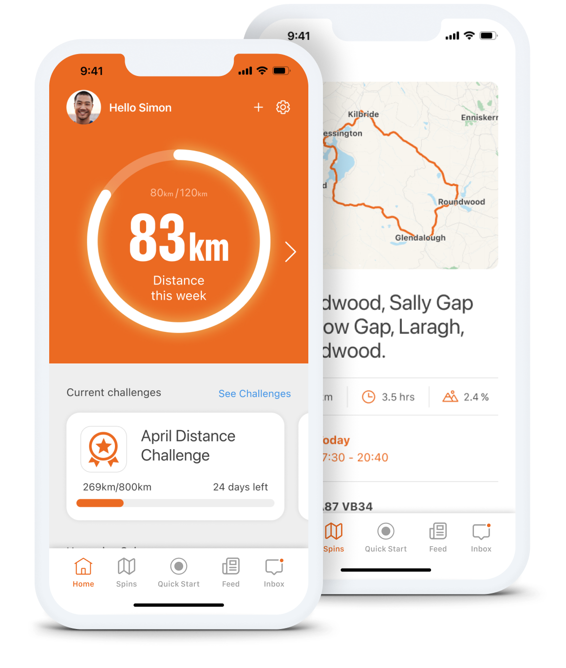
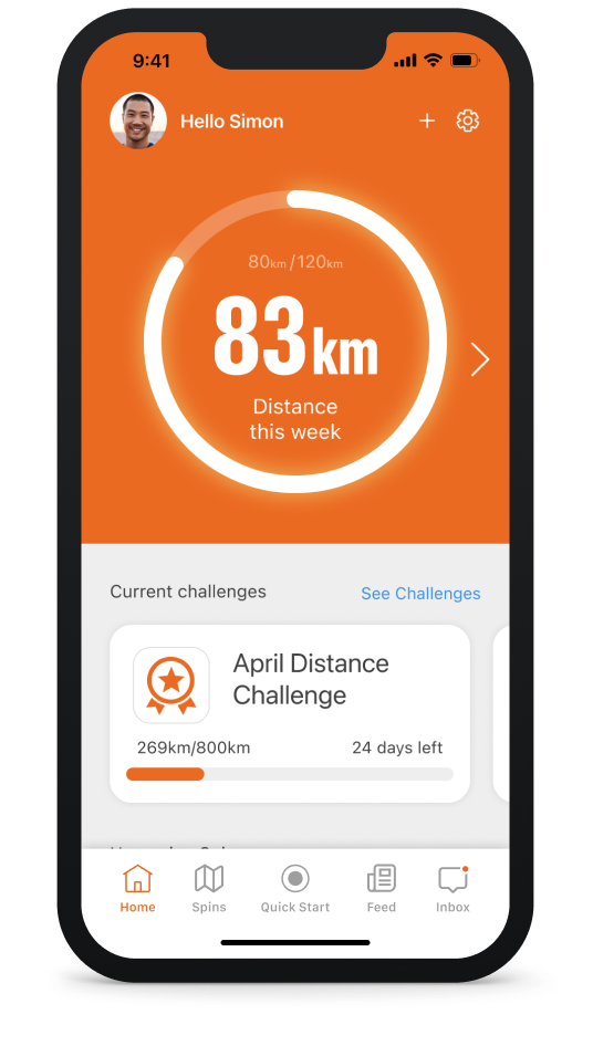
A high-fidelity prototype of an app for cyclists that promotes accountability through connection and goal setting.
Spins began as a cycling app concept by AFK Interactive Agency, focusing on social connections and fitness tracking for cyclists. Though it was initially shelved, in 2023, I revived the project. I transitioned from wireframes to a high-fidelity Figma prototype to bring this idea back to life. The app's primary goal was to enable users to monitor their fitness progress while promoting social bonds for team training that boosts accountability and leads to successful results. Optional goals and engaging challenges help to maximise your training enjoyment.

The Problem
When it comes to achieving your fitness goals, keeping things consistent is key. Even if you're a self-starter, there will inevitably be moments when the idea of sticking to a training plan feels less than appealing. Starting a fresh fitness regimen often leads to the blame game with external factors, but for most people, the real challenge lies in staying accountable to their goals.
The Pain Points
Lack of motivation
Starting plans and not sticking with them
Making goals and not achieving them
Not seeing any results
The Solution
Motivate, connect and be accountable.
Designed to assist individuals commencing a new training plan, the Spins app fosters encouragement and support by promoting connectivity with others and ensuring success through accountability.
Motivate
Easily connect and meet other cyclists.
Exciting Challenges to join.
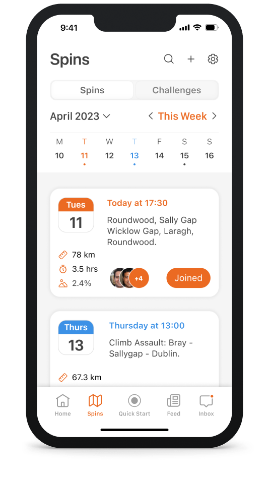
Connect
Invite, challenge, and chat to connect with like-minded individuals who share a specific interest in cycling.
Engage in direct chats in the spin events.
Check the feed wall to view the daily activities of all other followers and share your own achievements.
Accountability
Arranging to meet fellow cyclists with a commitment to mutual accountability.
Showing your activities and receiving positive likes and responses from friends.
Easily creating and accepting challenges to share with peers.
Research shows that participants have a 65% chance of completing a challenge when they tell a friend about it. But when they commit to meeting up with a person in real life, this number jumps to a staggering 95%.*
* Statistic from Association for Talent Development
Research Phase
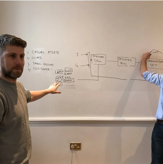
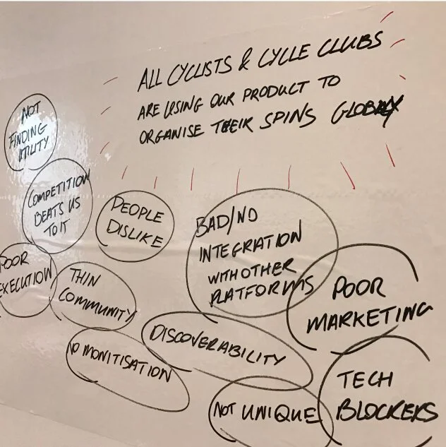
Brainstorming
Team workshop
The team gathered for an initial workshop during which we created initial sketches of low-fidelity wireframes, brainstormed ideas and features to benefit users in achieving their goals, and also engaged in some storyboarding.
Concept Stress Test
User Flow Exploration

User Flow Exploration
Ideation and sketching
Task Analysis and User Journey Mapping
Task analysis and user journey mapping helped us identify key steps for improving the user experience. Task analysis broke down actions, while journey mapping visualised the user's experience. These techniques enabled us to pinpoint issues and make improvements in the Spins app design.
Selecting a spin
Sketching the steps involved in selecting and joining an existing Spin.


Creating a spin
Sketching the steps involved in creating a new Spin from scratch and publishing it.


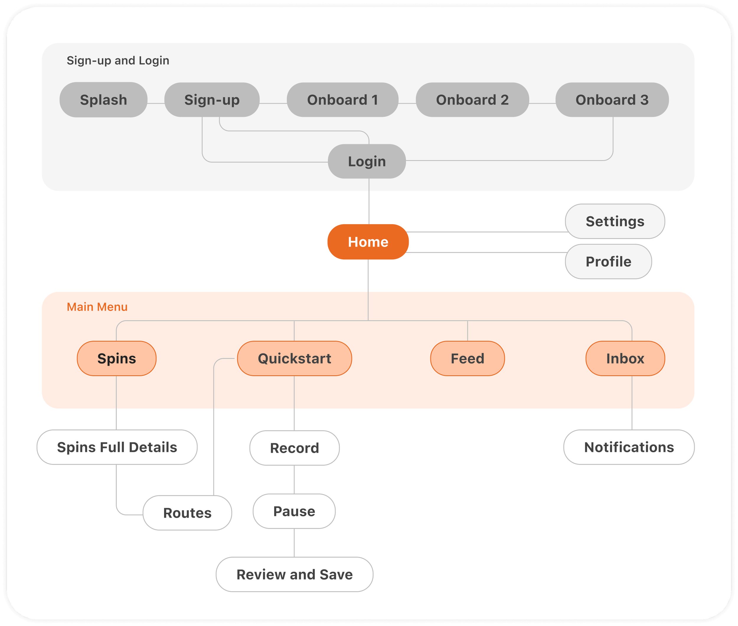
This sitemap for the app is a diagram that outlines the structure and organisation of the app's content, it shows the main sections or screens of the app and how they are connected.
Sitemap

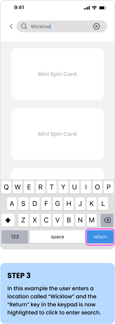
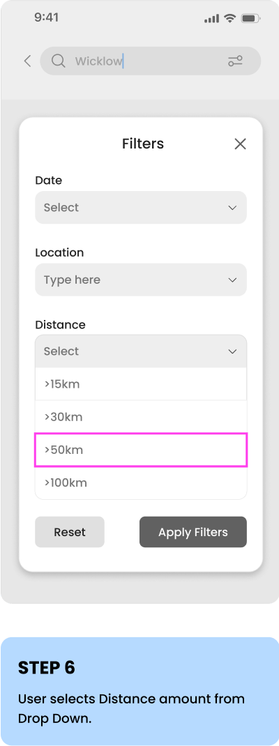
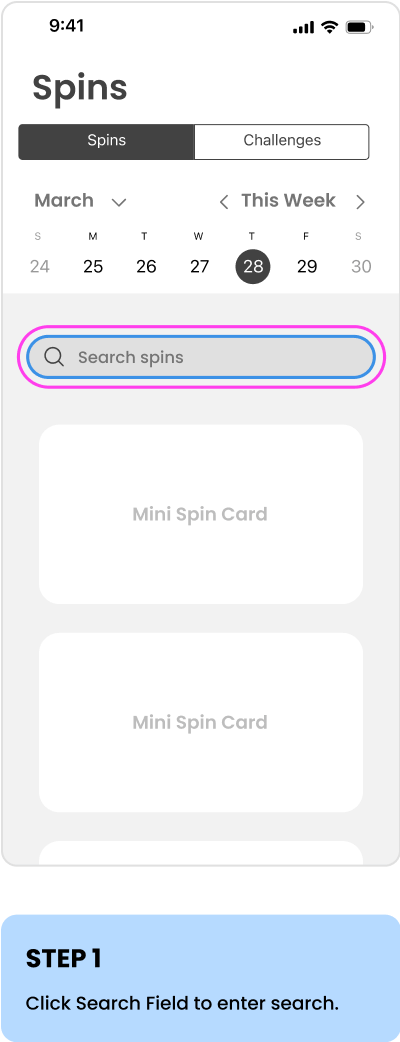
Wireframe
I created a wireframe for the app, which serves as a low-fidelity blueprint outlining the layout, structure, and functionality of the interface. Below is an example of the wireframe flow for searching by location in the Spins events and using a filter.


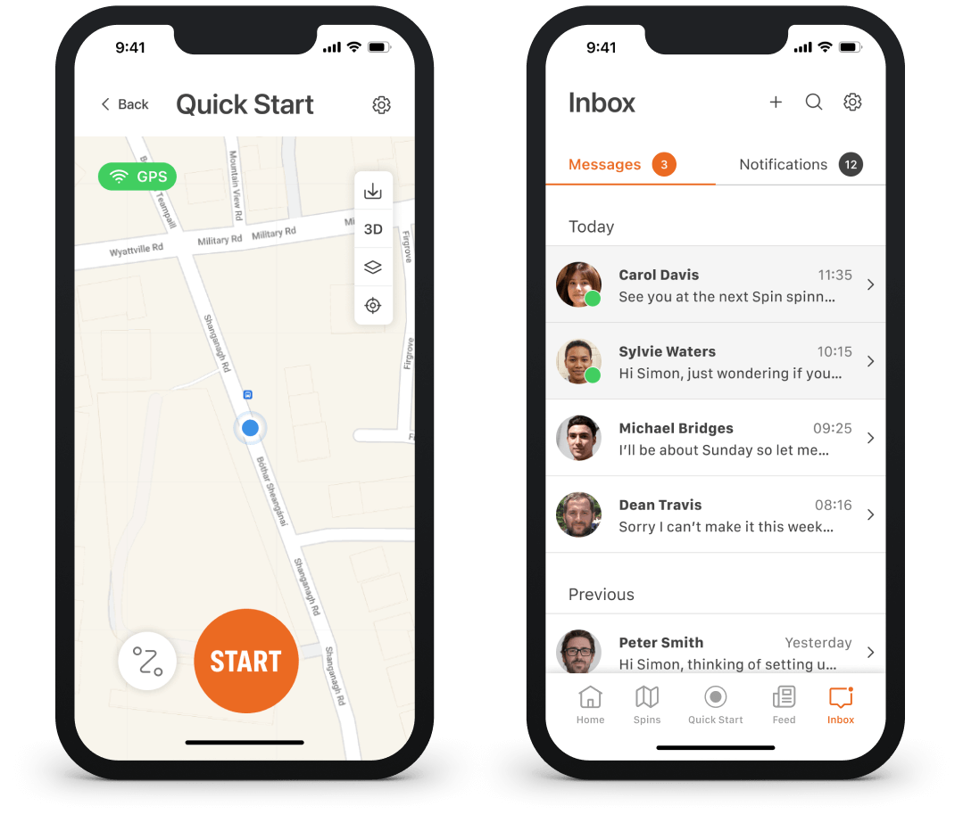
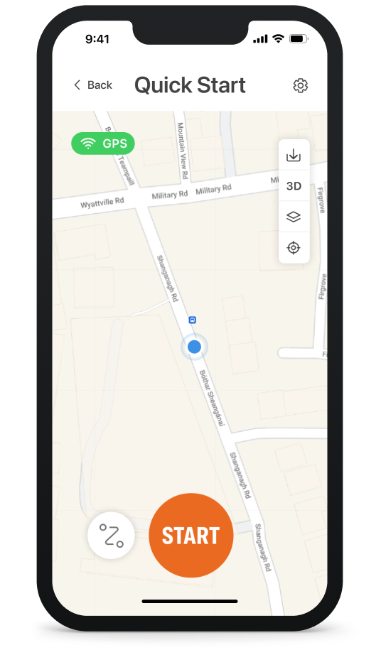
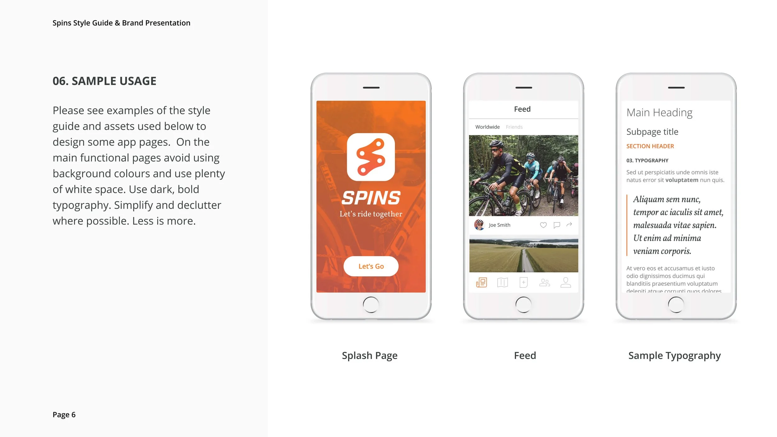
The Final Product
A high-fidelity interactive prototype of Spins app created in Figma.


👈 👀 Take a peek
Want to view the protoype in Figma? Click here.
Original Style Guide
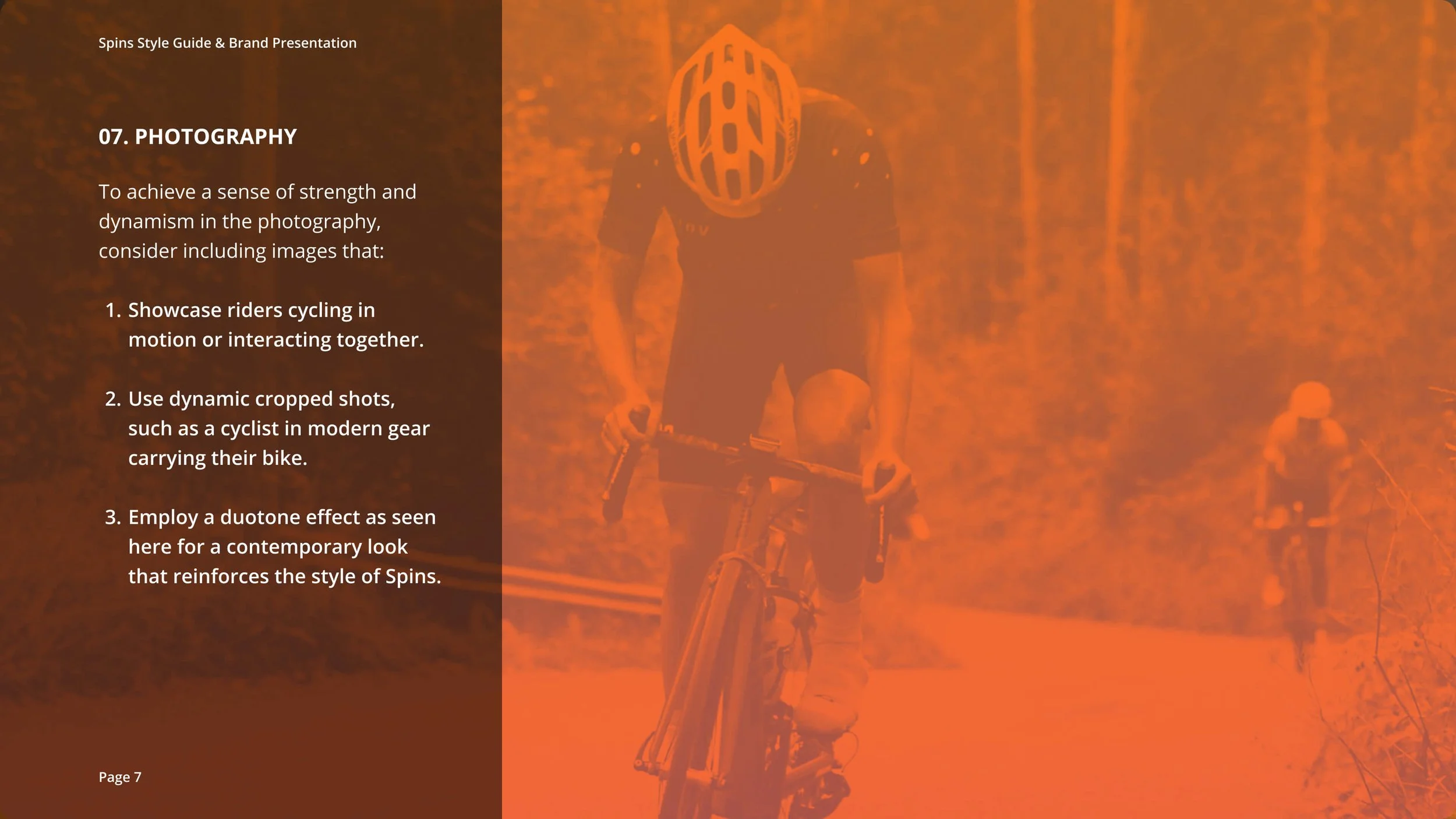
Below is the original Spins Branding Guide I created during the app's initial development, before it was discontinued. I later revisited it to create the high-fidelity prototype.

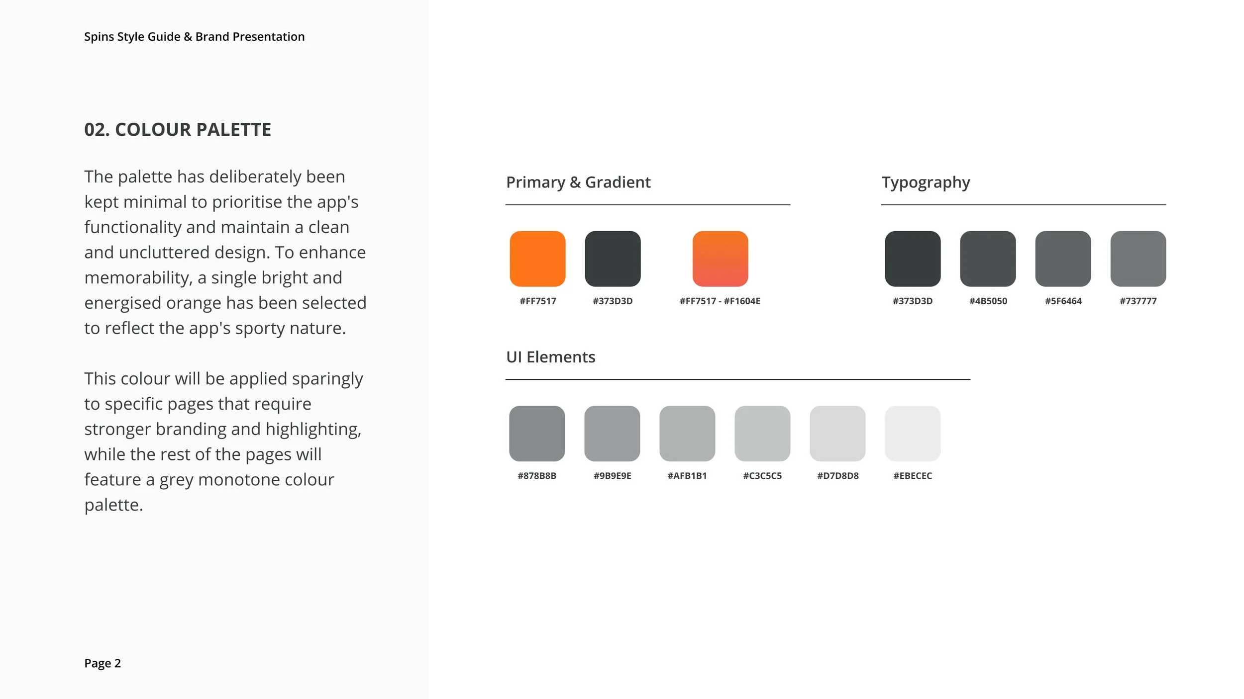
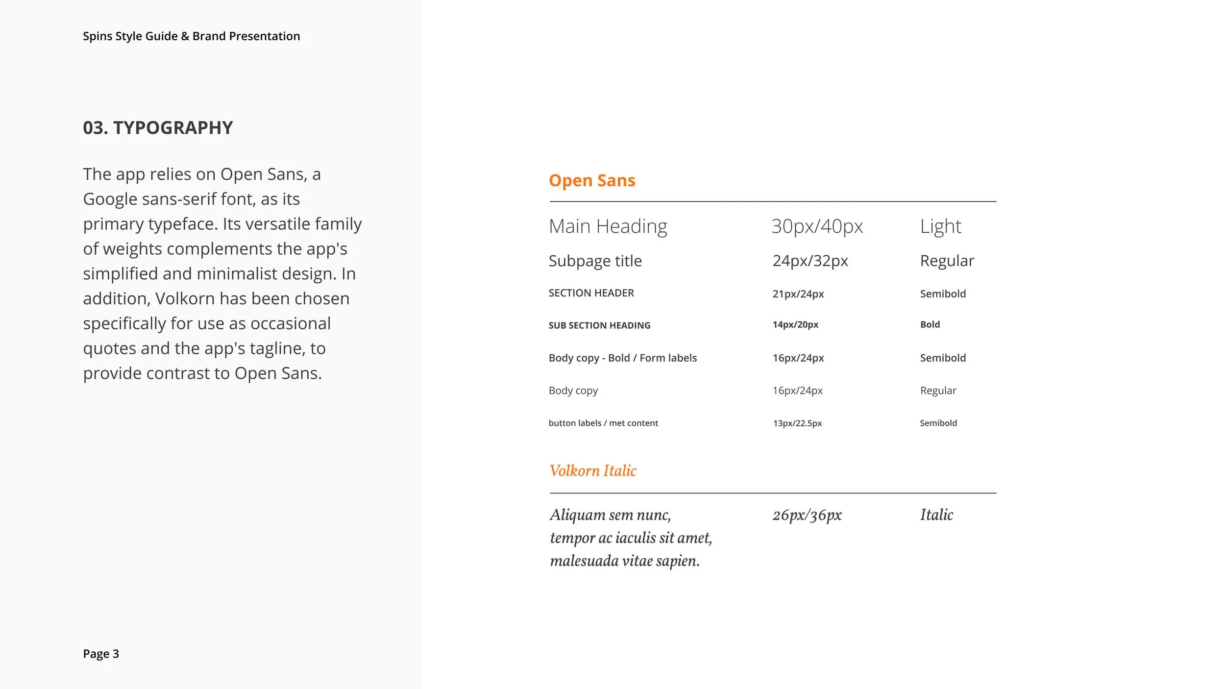
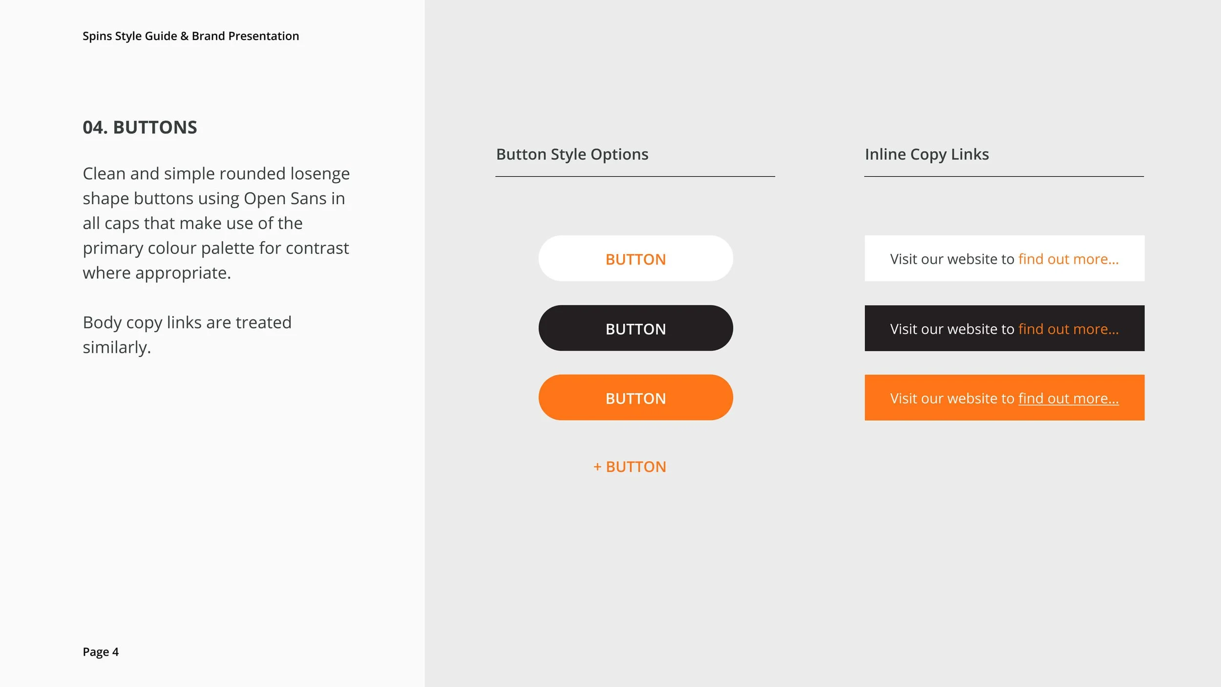
New Style Guide 2023
With the updated style guide, the logo remained unchanged, but there were refinements made to the colour palette and typography. Additionally, a new set of icons was developed to enhance the overall visual identity of the app.
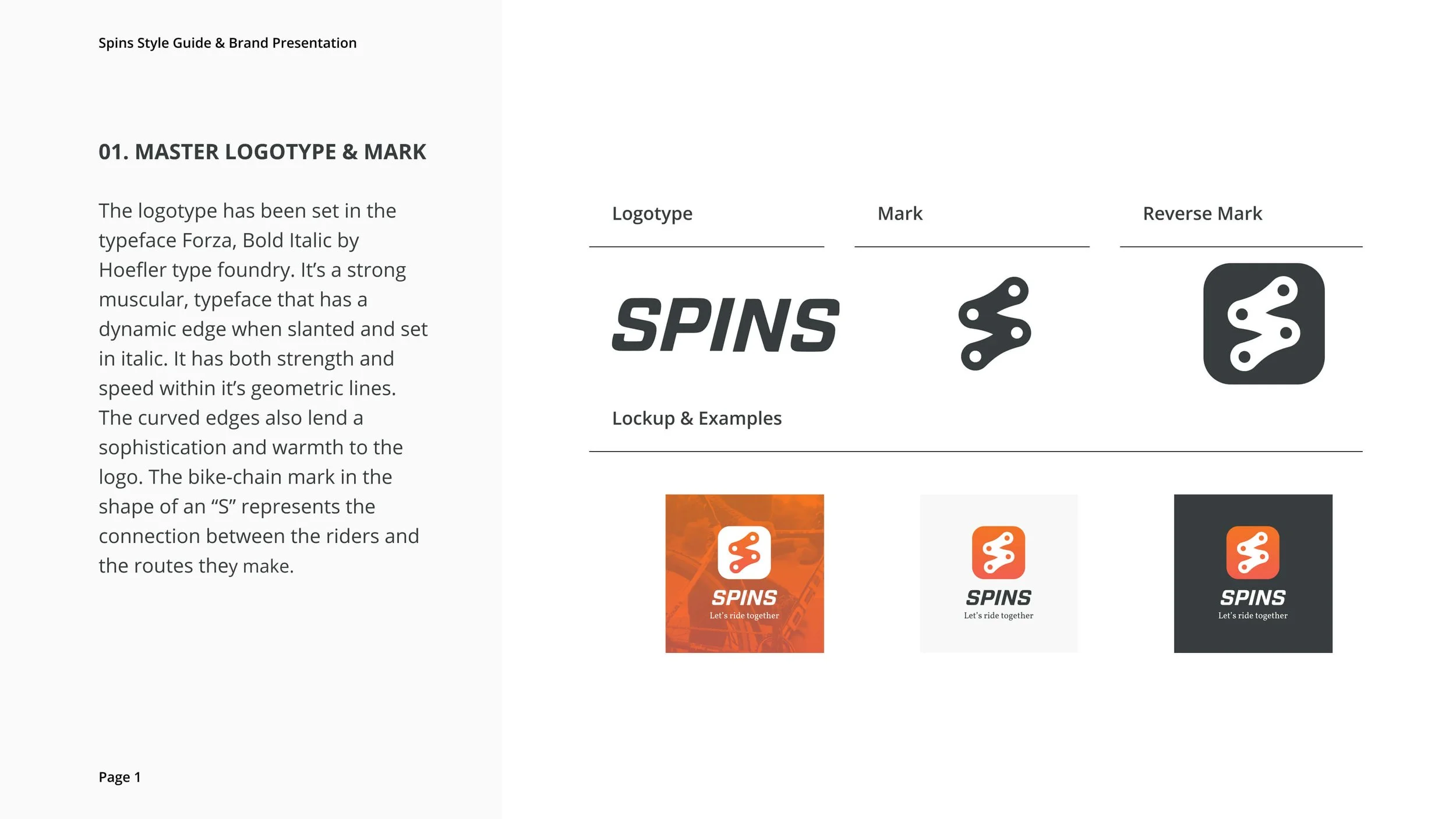
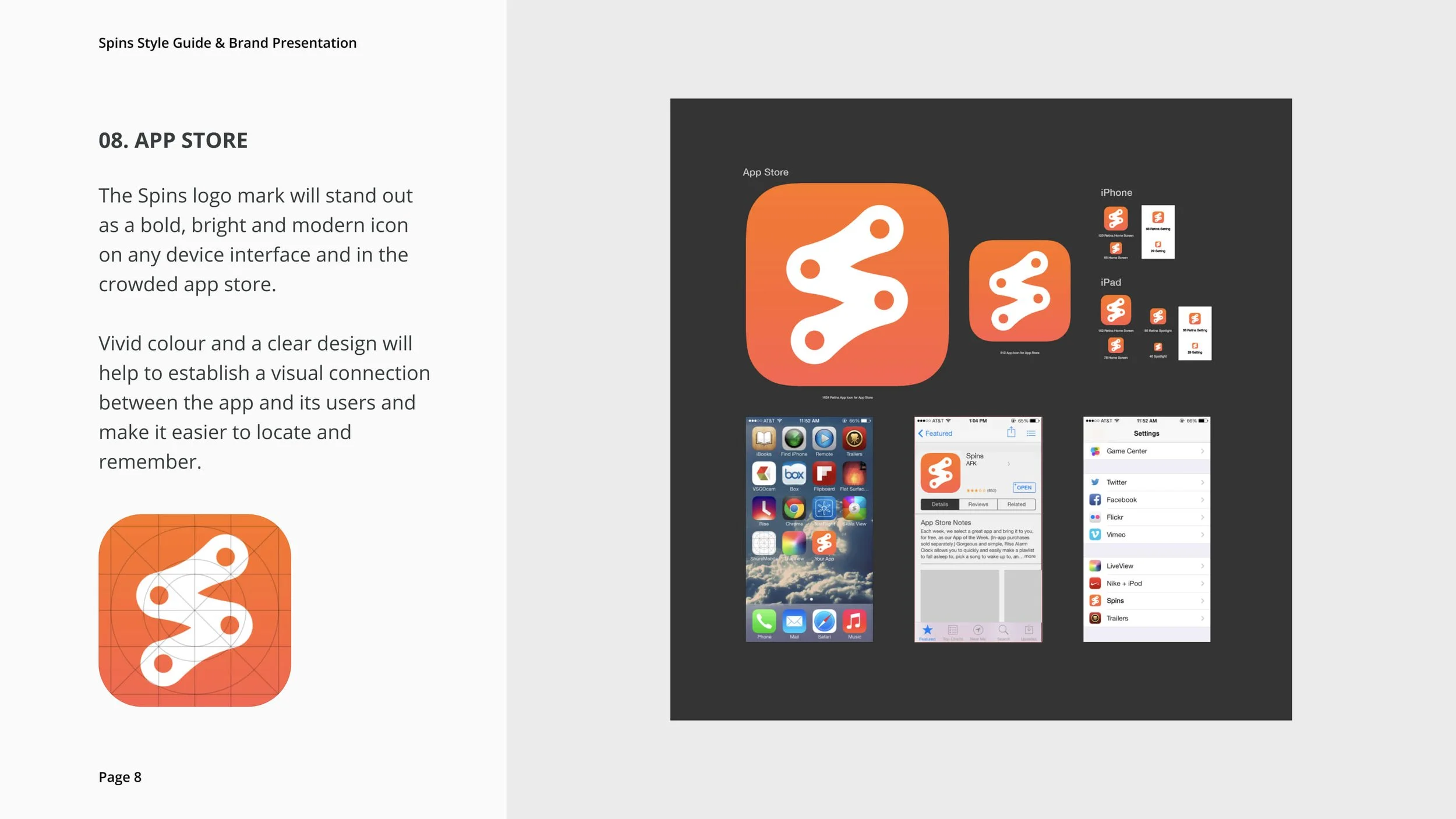
Logo
The Spins brand consists of both an icon logo and a wordmark, which can be used individually or in combination. The icon showcases an 'S' created from interlinked chain links. The chosen typography for the word 'Spins' was thoughtfully selected to convey characteristics of strength, speed, and dynamism.

Wordmark
LogotypeTypography
Utilizing SF Pro as our app's primary font guarantees a seamless experience throughout the iOS ecosystem. SF Pro serves as the default system font on iOS devices, ensuring our app's design coherence with other Apple applications. The SF Pro family encompasses nine weights, spanning from light to heavy, each accompanied by matching italics. This wide range of variations empowers designers to tailor the font precisely to their app's unique requirements.

SF Pro Typeface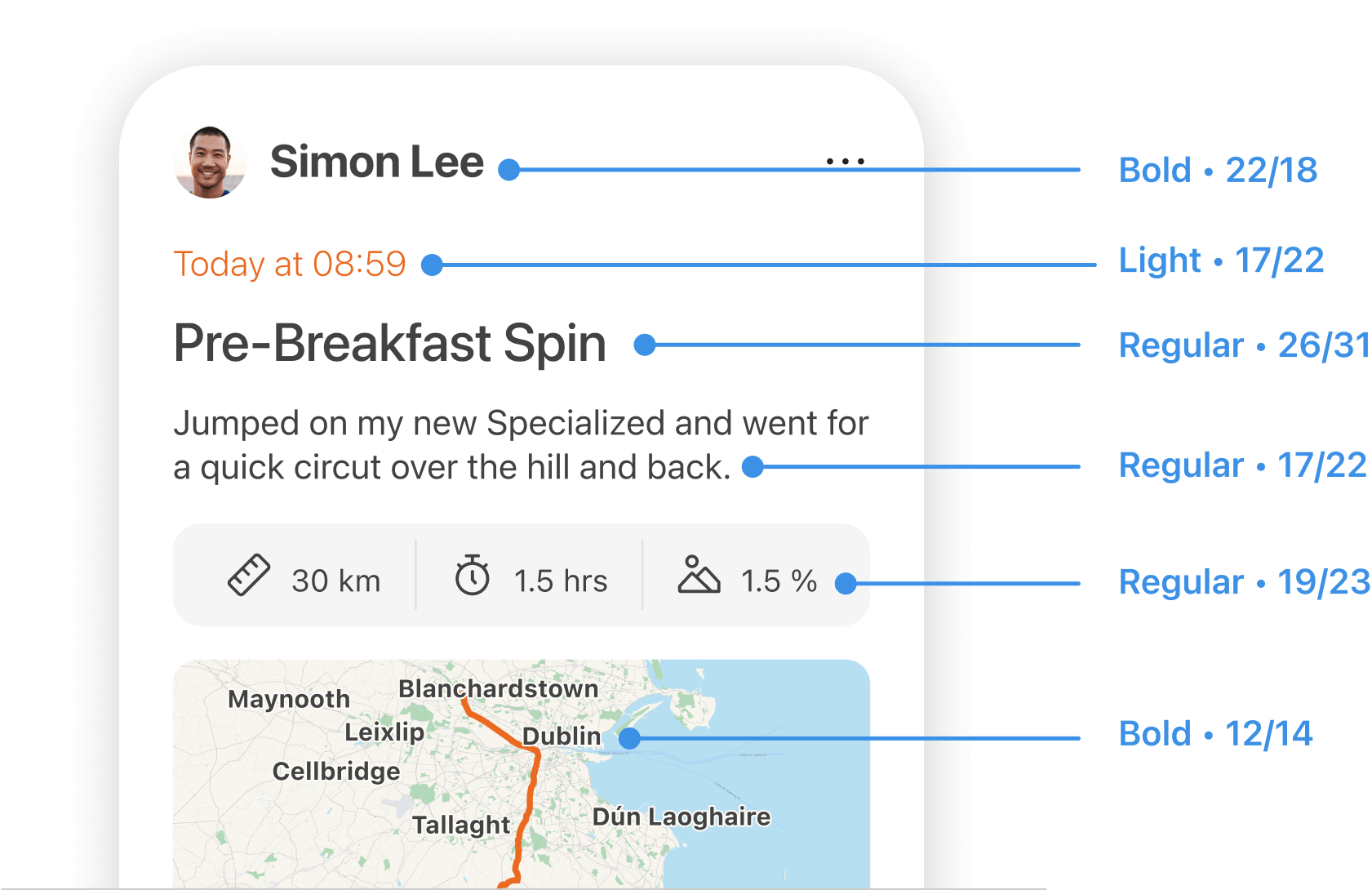

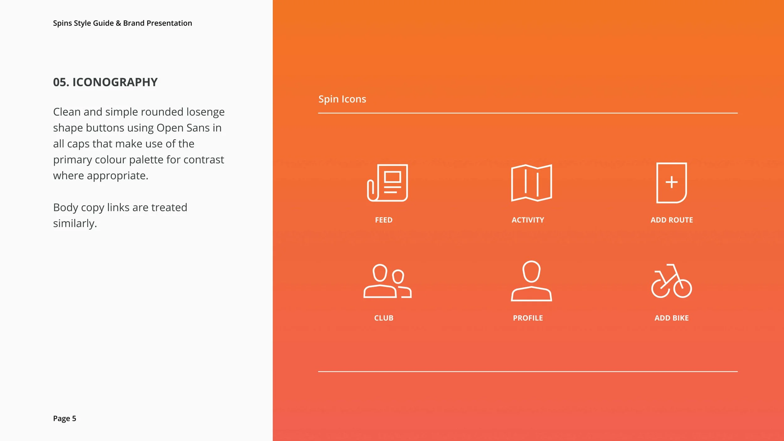
Iconography
I used Figma to create the Spins icon set. While I integrated a few icons from the existing Phosphor set, the majority were crafted from scratch with great attention to detail. I then made precise adjustments to ensure their seamless integration, resulting in a tidy and consistent collection. To fine-tune these icons, I relied on a template equipped with grids, essential guidelines, and exact matching of stroke and curve radii. Each icon was carefully designed as a component, with adaptable variables to suit various required sizes.

Gridlines Shape & Usage
SquareCircleRectangle
(Portrait)Rectangle (Landscape)Settings PageBuilding an Icon
When it comes to interface icons, you'll often find them fitting into basic shapes like landscape rectangles, portrait rectangles, diagonal rectangles, circles, triangles, or squares. In this project I stuck to a pixel grid and used a 1.5 pixel line (left-aligned) to keep things crisp. Starting with the most complex icon is a handy trick—it sets the tone for detail and keeps all icons feeling equally important. Consistency in style is key; it helps users easily grasp the icons' significance and purpose.

Example: Feed Icon

Spins Icon Set

Figma components
I designed component elements to be reusable throughout the project. Here are some examples.
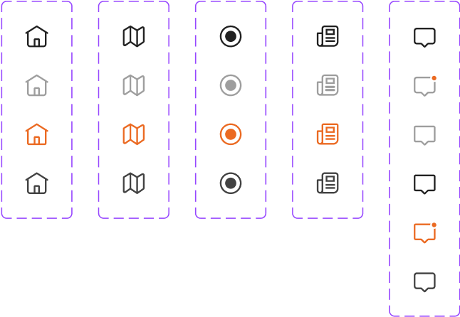
Main menu icons with active states
Join buttons

Spin card stack

Main menu component with active states

Challenge card stack

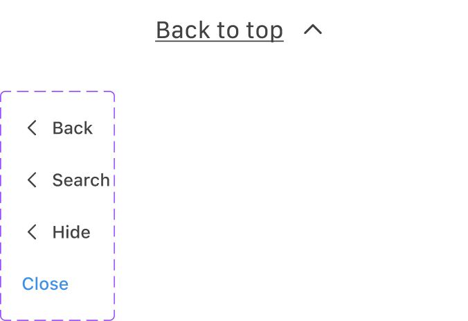
Back navigation
Bottom slider menu

Chips and toggles

Micro cards

Take-aways
My primary goal for this project was to become fluent in Figma and create high-fidelity prototypes. I consider this challenge a success, and Figma is now my software of choice.
Mastery of Interactive Prototyping: I've honed my skills in creating interactive prototypes that vividly demonstrate how the app works. This hands-on experience has significantly boosted my confidence in crafting engaging user experiences.
Emphasis on Design Consistency: Throughout the project, I learned the critical importance of design consistency. Maintaining a cohesive visual style and user interface elements across the app greatly enhanced its overall usability and user satisfaction.
Effective Use of Components: I discovered the power of reusable components in Figma. By efficiently utilising them, I realised how they can streamline design processes, ensure uniformity, and simplify updates across the app.
User-Centric Design: Developing a cycling app emphasised the significance of a user-centred design approach. Learning to prioritise user needs and preferences, as well as incorporating feedback into my design decisions, has been a valuable takeaway.
Prototyping for Feedback: Prototyping allowed me to gather valuable feedback and iterate on my designs more effectively. This iterative process reinforced the importance of user testing and continuous improvement in delivering a user-friendly product.
What I would do differently
Iterate as much as possible, especially early on. I explored numerous options, continuously seeking the ideal solution for this cycling app. In fact, I went through over three complete project resets, resulting in many iterations of my Figma file to ensure that every aspect of the app was carefully designed with clear intention.
Thank you for reading!
For more work inquiries or to grab a coffee, email me at: hello@ellenreynolds.me