
VISIT DUBLIN
Innovative interactive exhibit to inspire and inform Dublin tourists about the city and beyond.
UI Design Iconography

At-a-glance
A dynamic multimedia project enhancing visitor engagement through interactive displays and social media integration.
My Role
UI Designer
Illustrator
Tools Used
Adobe Creative Suite
Timeline
12 Weeks
The Project Overview
An advanced Tourist Information Hub in Dublin, employing cutting-edge technology to deliver up-to-date and relevant information to visitors.
I started working with Martello Media as a UI Designer for this project. Our objective was to establish an exceptional Tourist Information Center at 25 Suffolk Street in Dublin, using advanced technology to enhance the visitor experience.

Customer Journey
The objective behind the new Tourist Information Office was to inspire and educate visitors about the wealth of experiences Dublin has to offer.
This innovative facility strikes an ideal balance between tradition and modernity, combining the wisdom and warmth of the staff with a set of cutting-edge digital tools. These tools equip visitors to make well-informed decisions during their stay in Dublin.
Within this context, I took on the role of UI designer for the following digital interactive stations at the centre:
Interactive pods
Inspiration wall
Whats on Wall
Social Media Wall
App Collection Download Wall
To assist visitors in quickly accessing relevant information and displaying it elegantly, we designed a simplified map featuring key locations and attractions throughout Dublin. The map was orientated by the user’s current location at the Tourism Information Office. Visitors could browse through over 300 key attractions within Dublin.
I took a fully hands-on approach with hand-drawn street maps and a wide range of illustrated icons.
1. Interactive Pods

Interactive Pod Touchscreen

Interior view of the Tourist Information Office with Interactive Pods in the foreground and the Inspiration Wall in the background beside entrance to the facility.
Interactive Map
Each interactive pod features a touchscreen with a map primarily enabling visitors to peruse around 300 prominent Dublin attractions. The top navigation offers filter options by category including Top Attractions, Museums and Galleries, Historic Buildings and Gardens or Family Fun.
Access to other content is via the main menu. The other sections requiring a different design layout include Tours & Activities, Our Stories, Browse Attractions and FAQs.

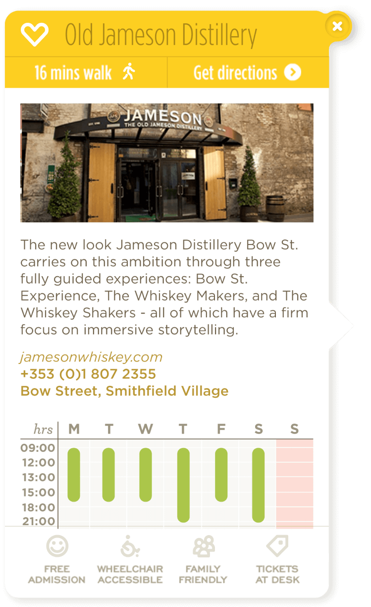
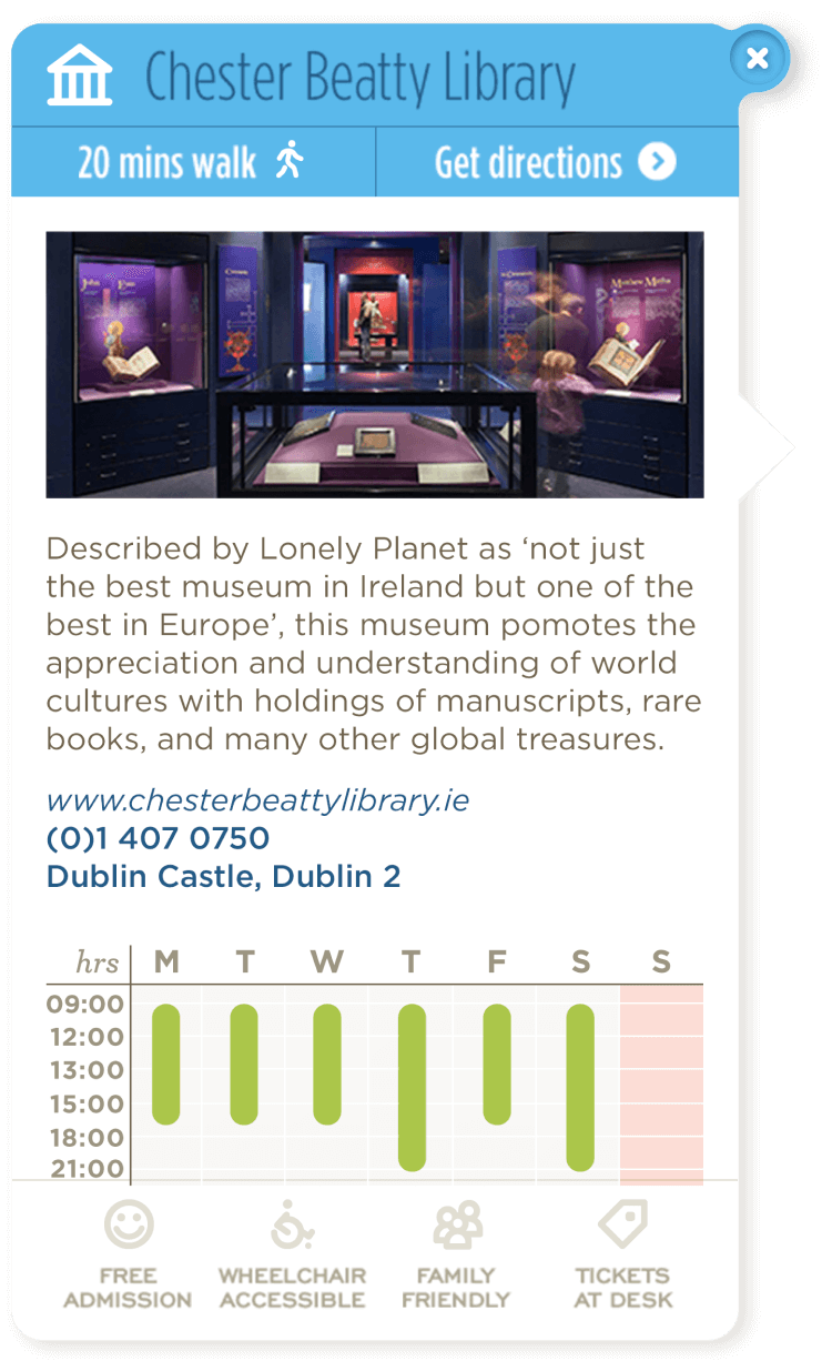
Each attraction is identified by an icon, and clicking on it brings up the Attraction Card with additional information, including distance, directions, opening times, and contact details. The map built on a Google map API is zoomable, allowing users to determine the distance and route from their current location to the attraction.
Interactive Map Card Components
A few samples of the Attraction Card design. They are colour-sorted by the various categories of sights to see in Dublin.

Map Key Icons
There are 300 attractions included on the Interactive Pod map, designed as both individual pins and pin clusters for closely located attractions. We also needed a range of additional pins, including those for transportation and historic buildings of interest.
Top AttractionsTours & ActivitiesFamily FunHotelsHistoric Buildings
& GardensMuseums & GalleriesInformationMap Transport Icons and Lines
Icon Set

Leave Behind Sheet
To complement the interactive map, we designed a double-sided A3 printed version, which we placed beside each Interactive Pod. Pencils were also provided, giving users the opportunity to take notes as they explored the pods and to carry the printed map when they departed from the centre.

2. Inspiration Wall
As you entered the facility, you were welcomed by a grand Inspiration wall, featuring a 5 x 2 metres tall video display showcasing breathtaking imagery from across Dublin. I was responsible for designing the map displayed on the large touchscreen positioned beneath the video wall, with each image simultaneously displayed and connected to the large digital map below, indicating the location in Dublin.
3. What’s on?
This section consisted of three screens displaying current events from around the city. Events were divided between the three screens as follows:
Screen 1: Upcoming events today and tomorrow.
Screen 2: Photography imagery updated regularly to display seasonal events.
Screen 3: Upcoming events for the following week and month.
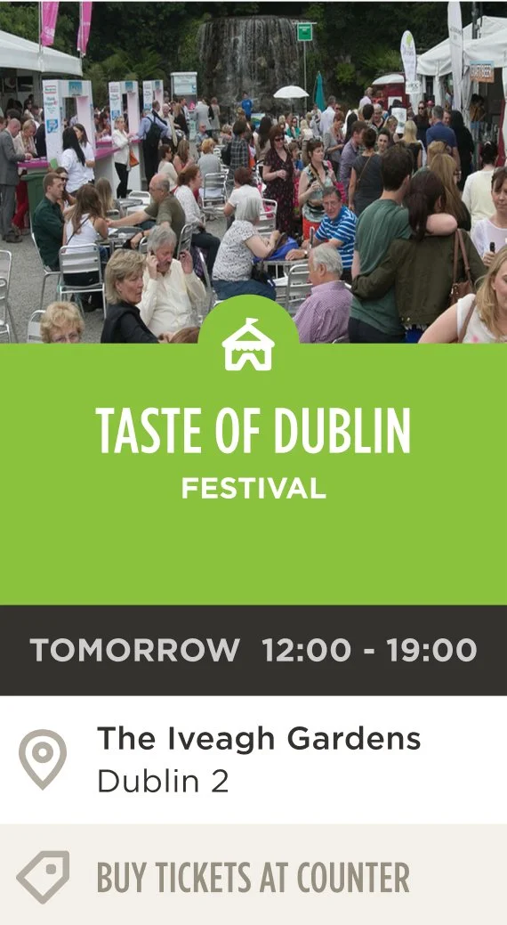
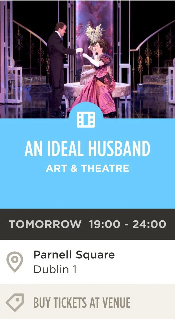
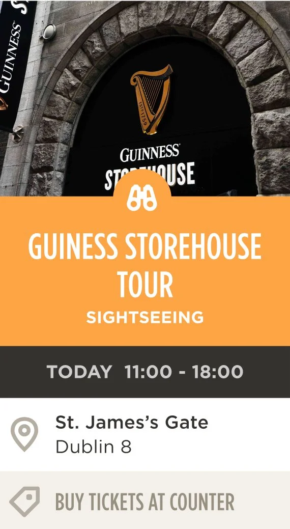
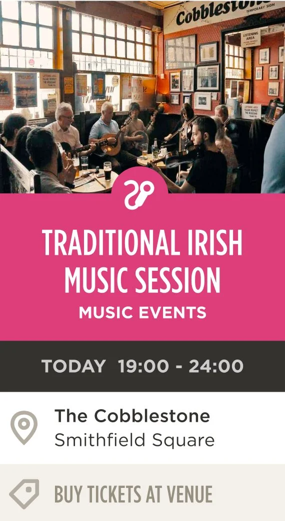
Each event card design was colour-coded by category and featured relevant information, including the title, times, and location, with a flexible template based on the content.

The 'What's On' section with the three screens.
The first screen showing feed of today's events.The What’s On card designs are flexible with the required content and colour-coded by event type, including Festival, Art & Theatre, Family Friendly, Sightseeing, and Music Events.
What’s On? - Card Components
A few sample card design below that represent the various categories of sights to see in Dublin.


4. Social Media Wall
An expansive 84” screen showcased live social media content from various social media feeds. I crafted a template for social media cards to streamline the flow of information. Additionally, I created a graphic treatment for 'Join the conversation #lovedublin,' and QR codes were made available for effortless access to Visit Dublin's social media channels.
Large 84" social media screen on back wall.
I created a template for the social cards, enabling content to flow seamlessly from the social media feeds.
With the hashtag #lovedublin, Martello developed software that allowed the staff at the main desk to regularly monitor and approve posts from Facebook, Twitter and Instagram for display on the Social Media wall.
5. App Download Wall
I designed the template for the large screen that houses recommended app downloads useful for visitors touring Dublin and Ireland. Each app includes some details, a QR code for easy access, and an image highlighting the app's main features
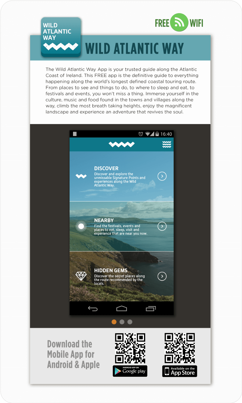
Template design for the App Downloads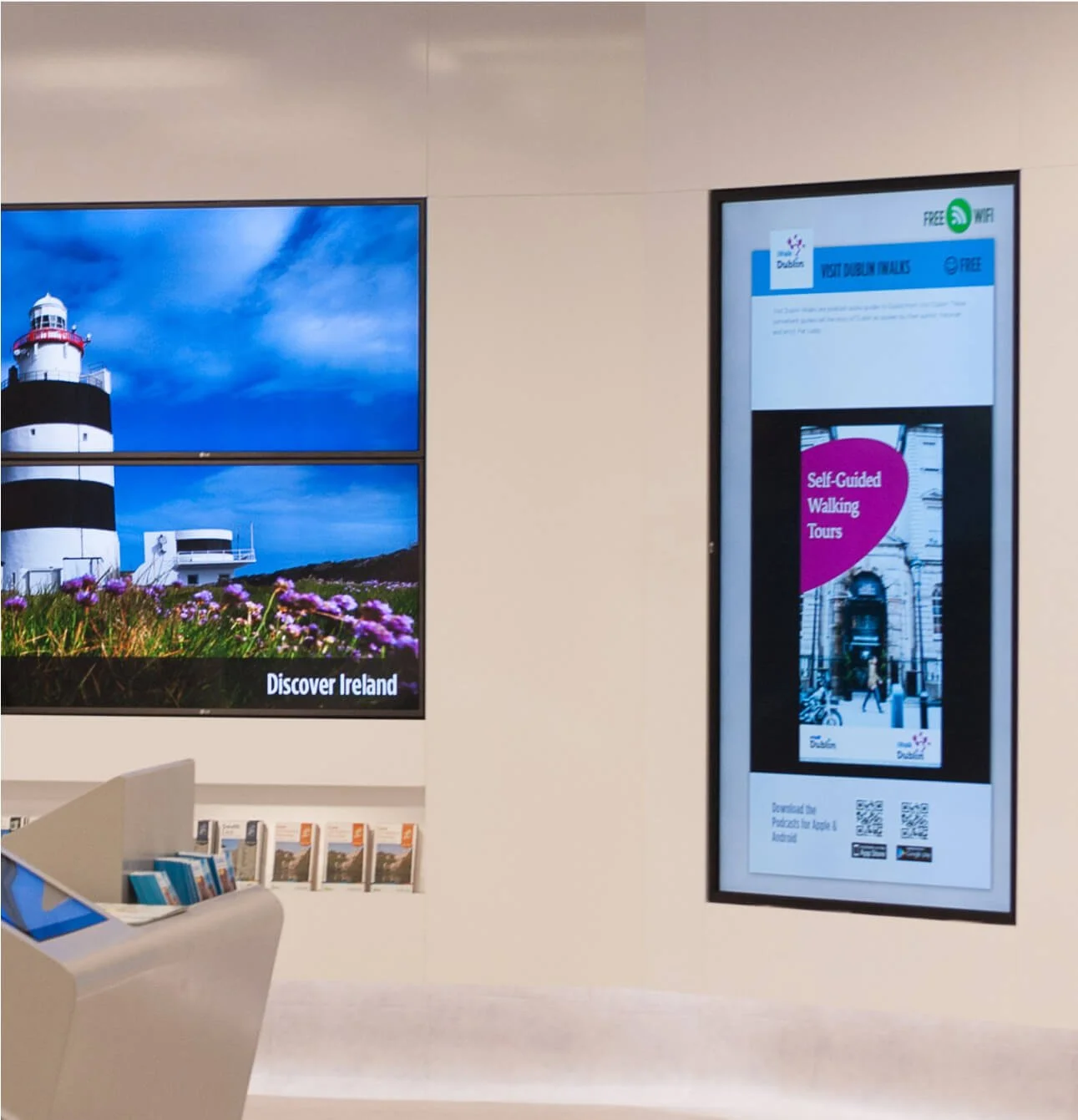
The App Download Wall on the right hand side.Conclusion
Take Aways
It was a great experience collaborating with the excellent Martello Media, who provided the UX for this project and the designed the space. I designed the UI based on their input, and our work together involved multiple iterations. We frequently met to present and assess the progress of the designs.
It was a great experience collaborating with the excellent Martello Media, who provided the UX for this project and designed the space. I designed the UI based on their input, and our work together involved multiple iterations. We frequently met to present and assess the progress of the designs. The main takeaways from this project revolve around several critical considerations:
Design Flexibility: The project required a versatile, cohesive design system implemented across a variety of content types.
User Engagement: Our primary focus was to engage users effectively, achieved through interactive kiosks, QR code interaction and social media integration. Every station was carefully designed with user interaction in mind.
Visual Communication: Given the wealth of information to convey, the design had to strike a balance between being both clear and engaging. I used a colourful palette for a fun and friendly family vibe .
Thank you for reading!
For more work inquiries or to grab a coffee email me at: hello@ellenreynolds.me