
FLY UX
Finding solutions through solid UX research methods to improve an airline booking system.

User Research Usability Testing Interaction Design Prototyping
Overview
As part of my Professional Diploma in UX Design with the UX Design Institute, I designed an intuitive online booking experience for a startup airline called Fly UX. The goal was to gain a deep understanding of the UX design process and translate research data into actionable UX insights that improve the usability of the design.
My Role
UX/UI Research
& Design
Tools Used
Sketch
InVision
Figma/FigJam
Adobe Suite
Screenflow
SurveyMonkey
Timeline
April - September 2020 (6 months)

The Context
As part of my Diploma in UX Design from the UX Design Institute I was required to a carry out a case study and design a website prototype for a fictitious airline called Fly UX. Fly UX is a start up airline and they are looking to create an online booking experience that is fast, intuitive and easy. Using great design to give their product a competitive advantage.
Goal
My task was to gain a deep understanding of my target users and create an interactive website prototype with a specific focus on the booking process.
The Process
For this project I implemented the full UX design process. The research gained though the initial methods was then used to define the problems and develop an action plan, to create a well designed booking process presented as an interactive prototype.
The UX Process
1. Discover
Competitive Benchmark
Online Survey
Usability Test
Note Taking
Affinity Diagram
Customer Journey Map
2. Define
Findings
Features List
3. Ideate
User Flow Diagram
Wireframe Sketches
4. Prototype
Prototype
Hand-over Documentation
1. Discover
Competitive benchmark
To begin my research, I studied the websites of three booking platforms and a booking aggregator app. I chose Aer Lingus, Ryanair, British Airways and Airbnb. My goal was to use heuristic principles as a guide to discovering how competitors solve similar UX problems, and highlight best practices as well as practices to avoid. I also wanted to understand the conventions of a booking process so I could understand what my users would expect.

Key Findings
Auto-location should recognises users location and then insert the nearest airport in the search bar for ease of use.
Auto-suggestions. For intuitive smooth user flow there should be auto-suggestions in forms.
A progress bar should be present during the booking process for clear navigation.
Navigation Control. there should always be a way to click back a step - user should feel in full control of how they navigate through booking process.
Results filter. Provide an easy way to filter search results.
Clear seat plan. A very legible and clear aircraft seat map so it is easy to understand.
Clear Call-to-actions. Should be used throughout the website for clarity.
Clear and transparent pricing. Clear pricing regarding the flights and break-down of the costs.
Online Survey
To gain a better understanding of airline users and their habits, I conducted a survey of 16 participants through an online questionnaire. The questionnaire included both multiple-choice and open-ended questions to gather both quantitative and qualitative data. Key findings from the survey were:
Desktop preferred for booking. 70% of users book flights on a desktop computer or ipad and 30% use mobile. Of those that use the mobile app, the age demographic is generally younger between 20-40 years of age.
Travel companionship popular with leisure trips. For leisure most users travel with one or more companion, for business most travel alone.
Common to take several days from research to booking. Most travellers take at least several days or more to organise their flights, from the time of deciding to travel, through research, comparison and finally booking. 23.5% take one day to book.
Highly requested features. Clarity of information and ability to compare prices and filter results were most popular features when booking.
Top pain points. Users main pain points are cluttered information and adverts.
Most popular airlines. In the surveyed geographical area (Ireland) the most popular airlines were Aer Lingus, Ryanair, and British Airways.

Usability Test
I conducted a comparative usability test, starting with interviewing the user and then set tasks that focused on the booking process of the desktop version of two popular airlines. The two test tasks involved booking a short-haul flight with Aer Lingus and booking a long-haul flight with Virgin Atlantic that included a connecting flight.
The aim was to uncover the context of use, of people booking through airline websites and the goals and behaviours when booking flights.
User Insights
Trust Issues (27 secs)
Arrival Time (27 secs)
Virgin Atlantic (1 min 51 secs)
Personable Language (1 min 14 secs)
Filter Confusion (29 secs)
Extra Information (19 secs)
Unclear Information (26 secs)
Choosing Seats (2 min 26 secs)
Information Driven (29 secs)
Affinity Diagram
Along with a work colleague, we began a brain storming session using the gathered content from the various research methods. We mapped out ideas and information onto sticky notes, and then grouped them by similartities. These patterns allowed us define the main issues in relation to the booking process so that we could begin designing the solution.
We started by placing a single point of interest on a single post-it.
1.
Looking for similarities and grouping these together as patterns start to reveal themselves.
2.
Figuring out the name that suits each group so we can define the key sections that stand out.
3.
Some Key Insights…

Users crave for simplicity and speed when opening the app for the first time.

Users like to keep track of the price during the booking process and like to easily compare prices when choosing flights.

Users crave for simplicity and speed when opening the app for the first time.

Users appreciate extra details such as list view and search when looking for inbound/outbound flights. Clunky and slow apps decreased trust.

Users are careful when sharing personal and financial information.

During flight selection process users want to feel the sense of control and have relevant information on hand.

Users notice and appreciate clean and simple apps. Informational hierarchy is important to them.

Customer Journey
Next my goal was to was to create a user journey that maps the flight booking experience from initial research to ticket purchase. I used the main findings to create a visual representation of the customer's journey, including touch points and interactions with our airline at each stage.
The benefits of making a customer journey map are numerous.
Understanding customer better. It helps us to understand the customer's experience with the airline in an holistic way, which can help to identify pain points and areas for improvement. By understanding the customer's needs and goals at each stage of their journey, we can make informed decisions about how to improve their experience, whether it be through better customer service, more convenient booking options, or more comfortable in-flight amenities.
Align team. A customer journey map can help to align our team's efforts and ensure that we are all working towards the same goal of improving the customer experience.
Unique angle. It can help us to differentiate ourselves from competitors by offering a unique and seamless customer experience that sets us apart.
2. Define
Key findings
The key findings below were found through my research. I focused on these key findings by defining the problem and solution.
Price Confusion
A lack of clarity in relation to pricing is a major obstacle in the booking process…


Confusing Navigation
Cluttered information and unclear navigation hinders booking process...


Lack of Transparency
A lack of transparency can erode trust, some issues are...
3. Ideate
User flow diagram
This user flow focuses on the specific task of making a booking though the airline website. The user flow lays out the user’s movement through the product, mapping out each step the user takes—from entry point right through to the final interaction of purchasing flight tickets.
User Flow Design Update
UX is an iterative process and the above user flow was updated after reviewing the prototype (in the next steps). Subsequently this user flow and the prototype were updated with the following improvements to the navigation stepper including:
a new passenger details page
a travel extras page
Customer Journey
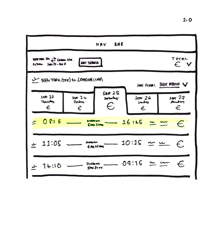
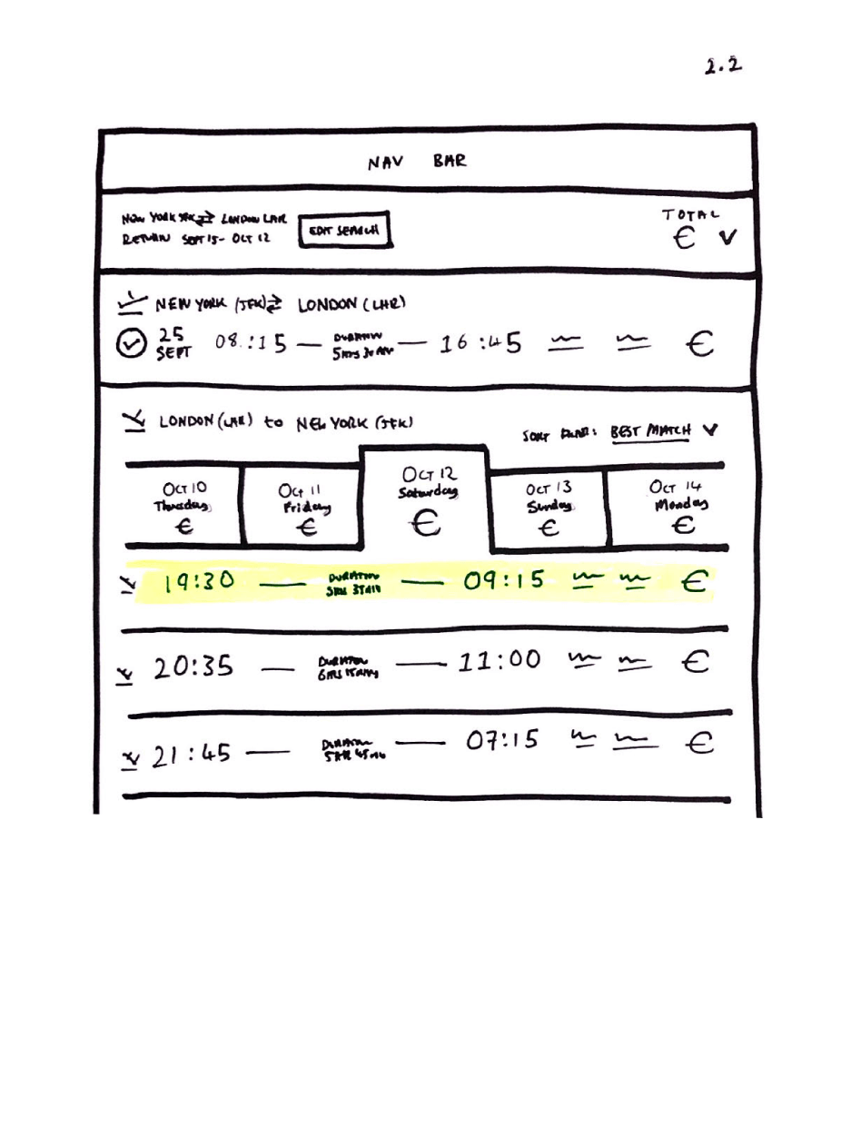
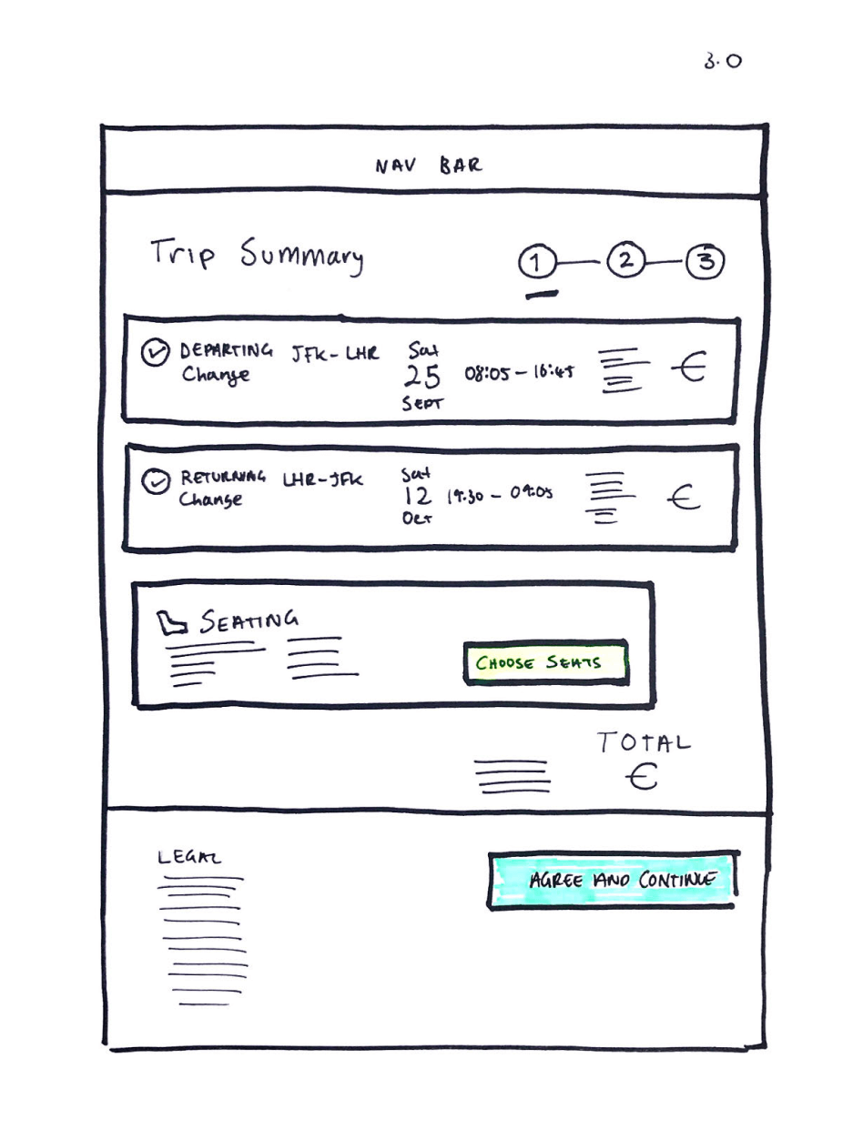
I created a wireframe sketch based on the user flow diagram. This is a low fidelity prototype of the website which aims to get a basic concept of how the booking process will work in user interface form.
By sketching with pen on paper, it allows for the ability to quickly and freely explore and iterate different ideas relating to the UI design on the various steps of the booking process.


4. Prototype
Medium-fidelity prototype
I developed a medium fidelity prototype as an improvement over the low fidelity version. This prototype takes the form of a wireflow that guides users through the process of making a booking on an airline website. It represents a significant advancement in terms of design, featuring precise spacing, improved navigation, compelling headlines, and polished buttons. By providing a clearer understanding of the website's functionality, this medium fidelity prototype serves as an intermediary step before proceeding to the more detailed, high-fidelity prototype, which closely resembles the final product.
This medium fidelity prototype was created using Sketch and subsequently transformed into an interactive prototype using InVision

UI Specification
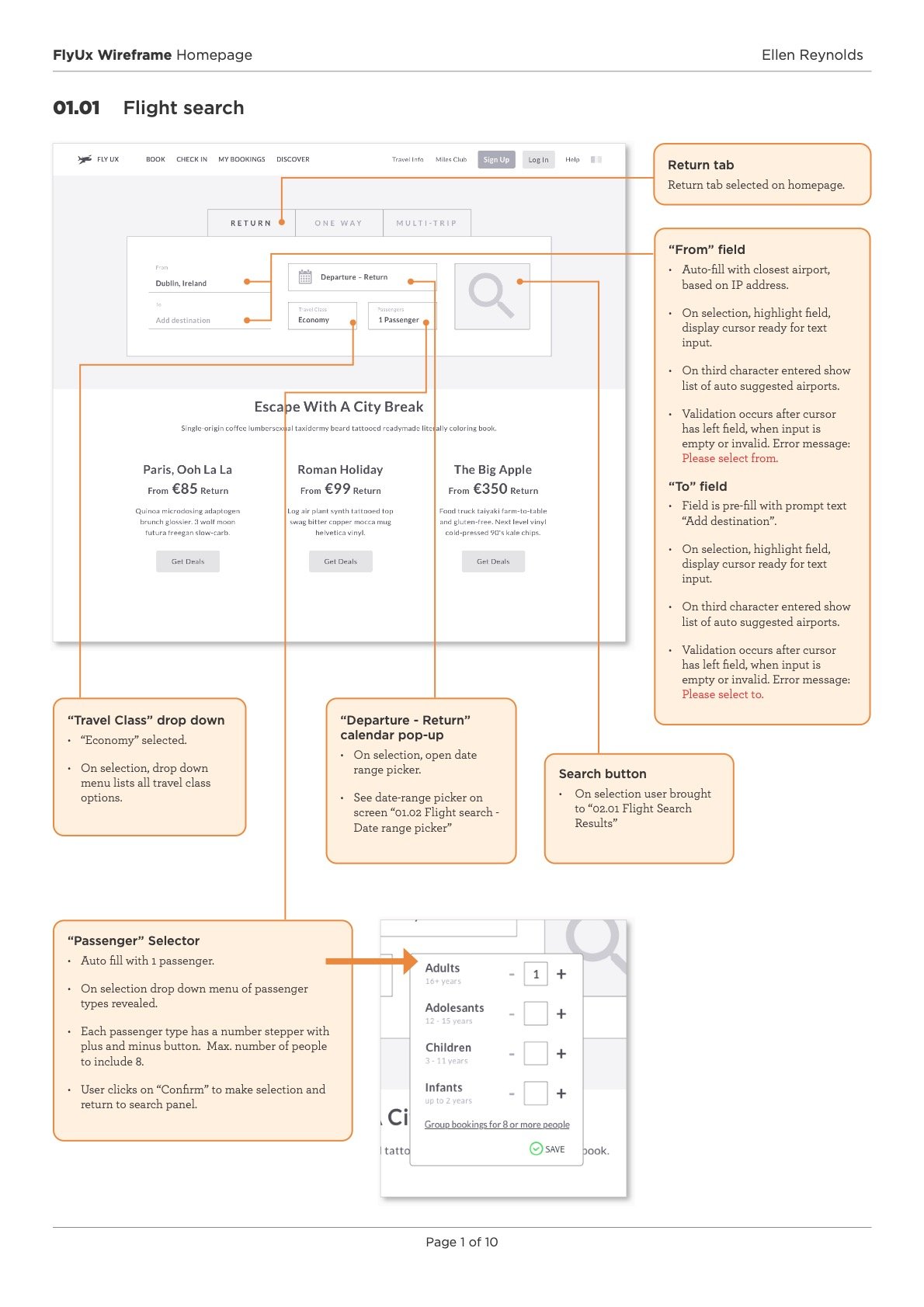
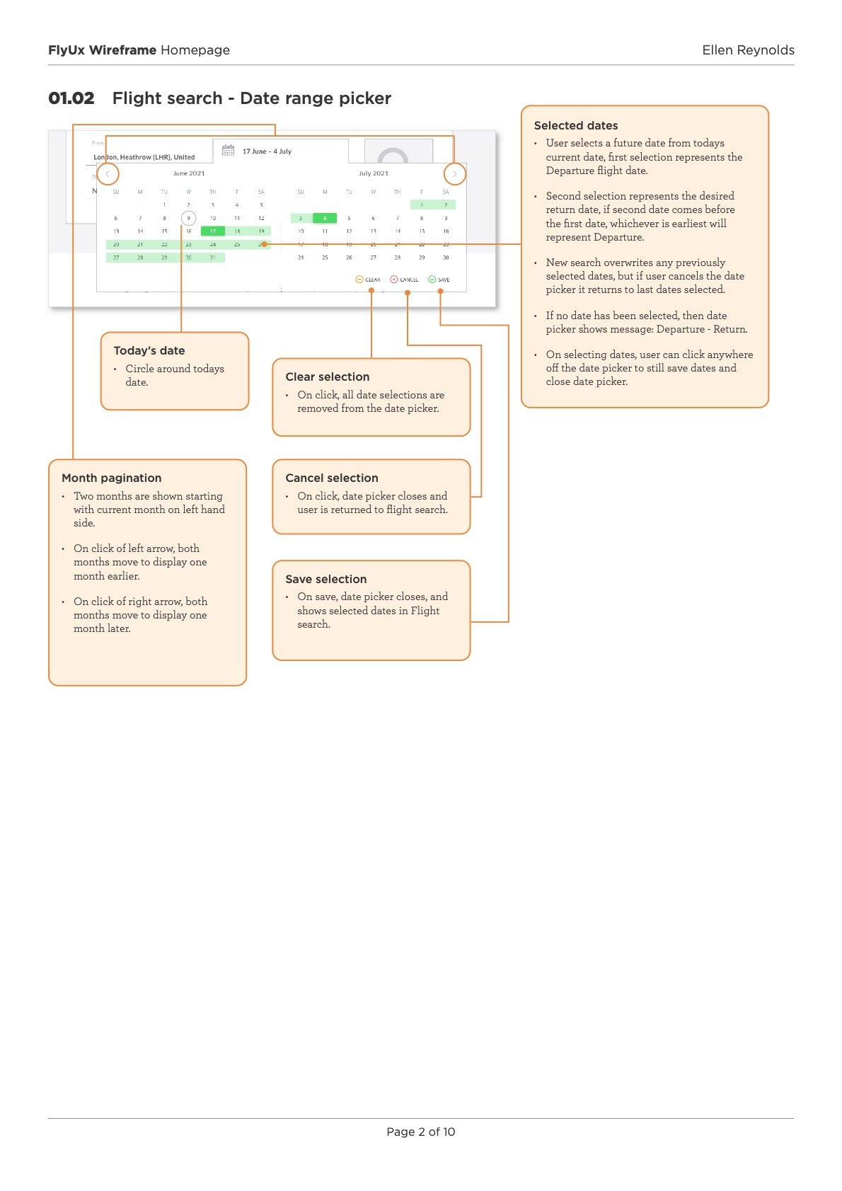
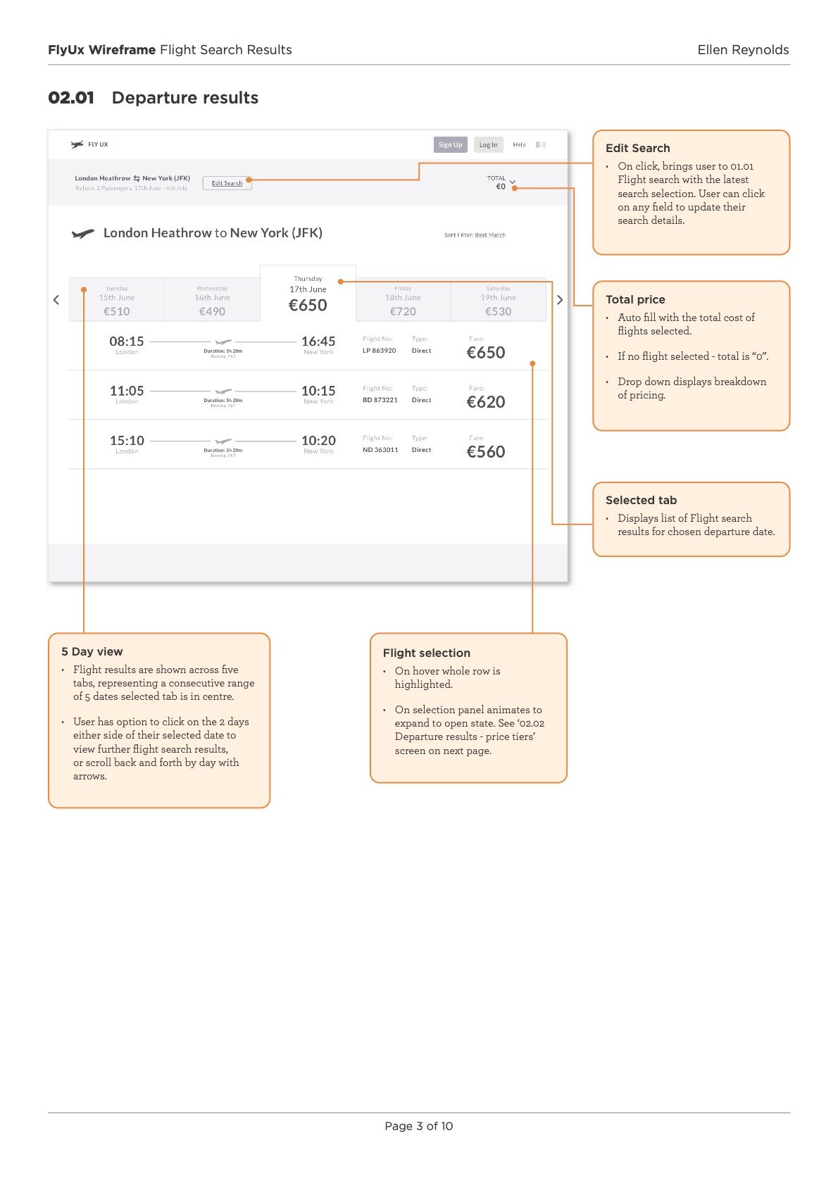
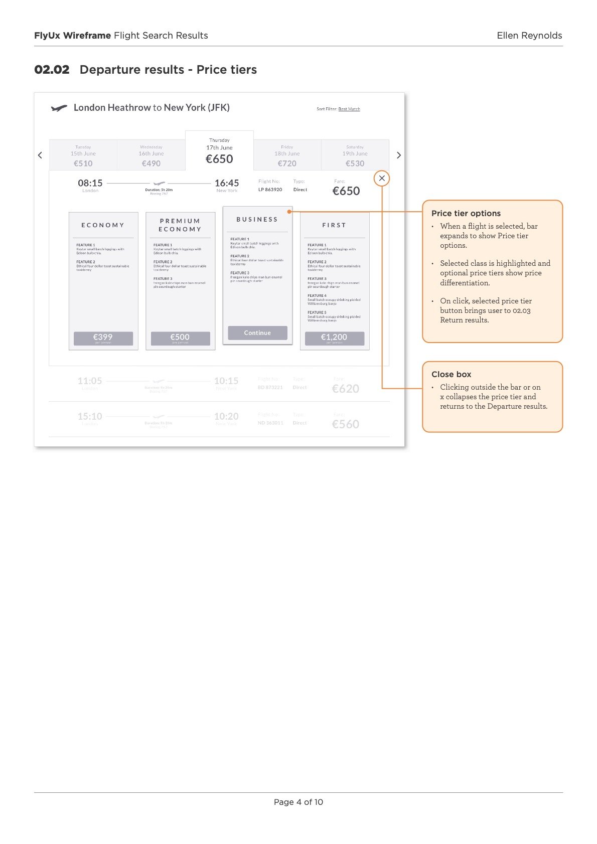
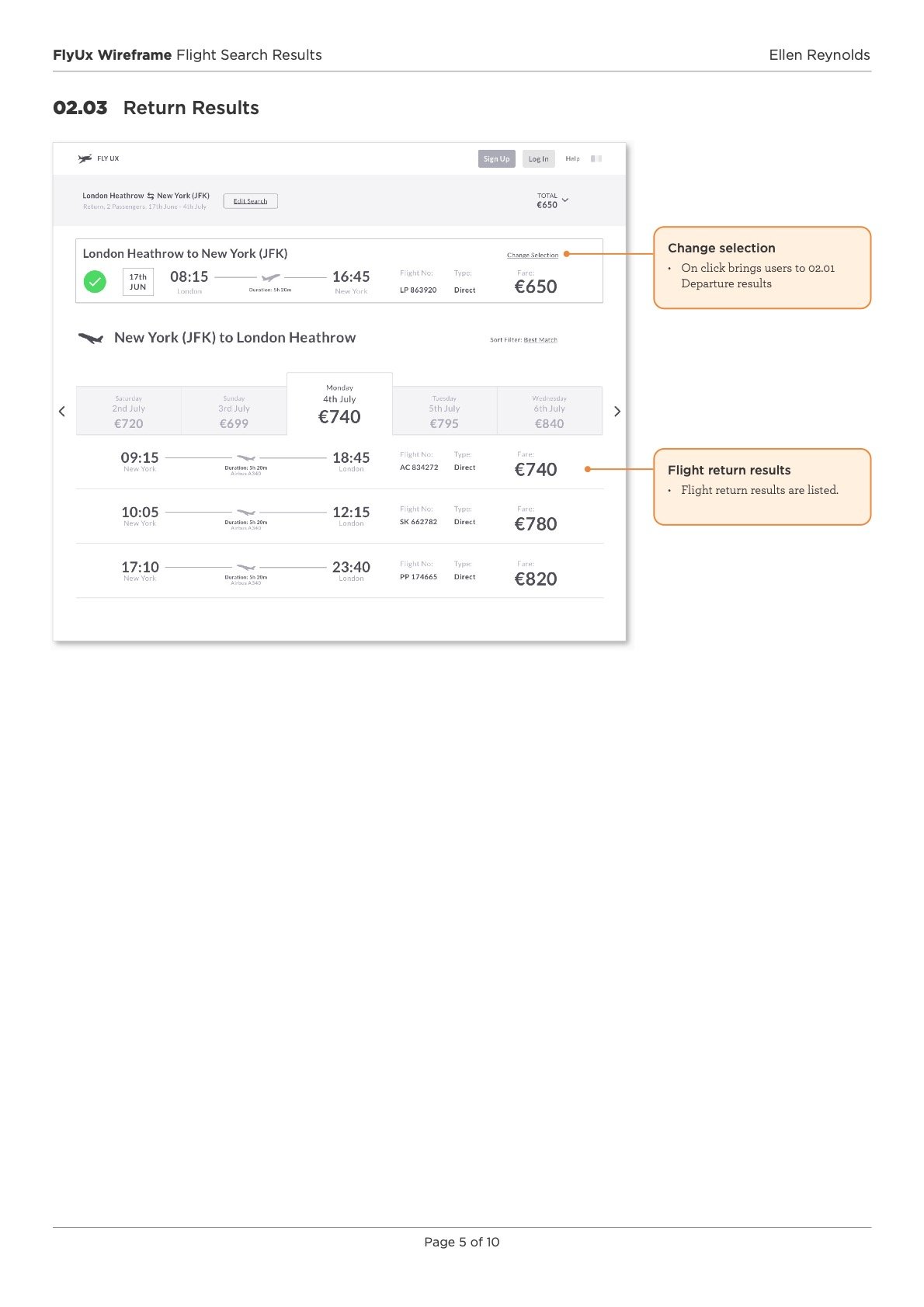
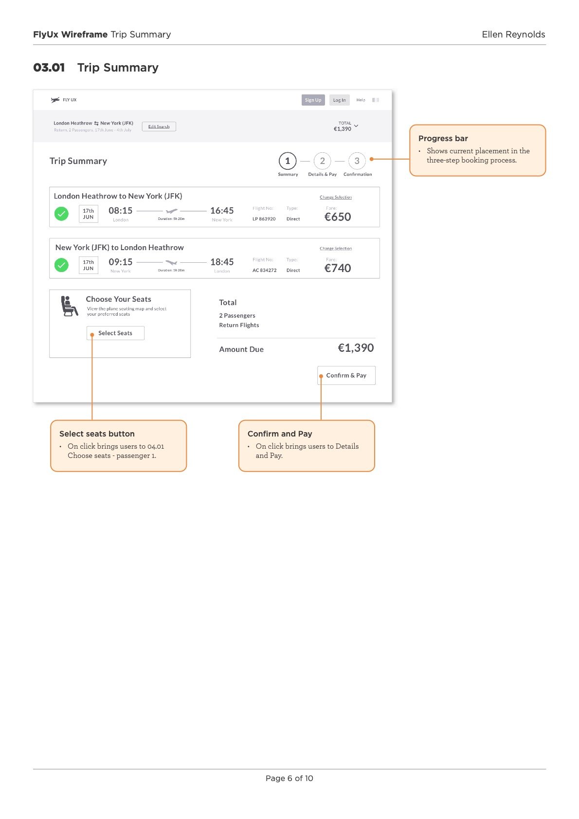
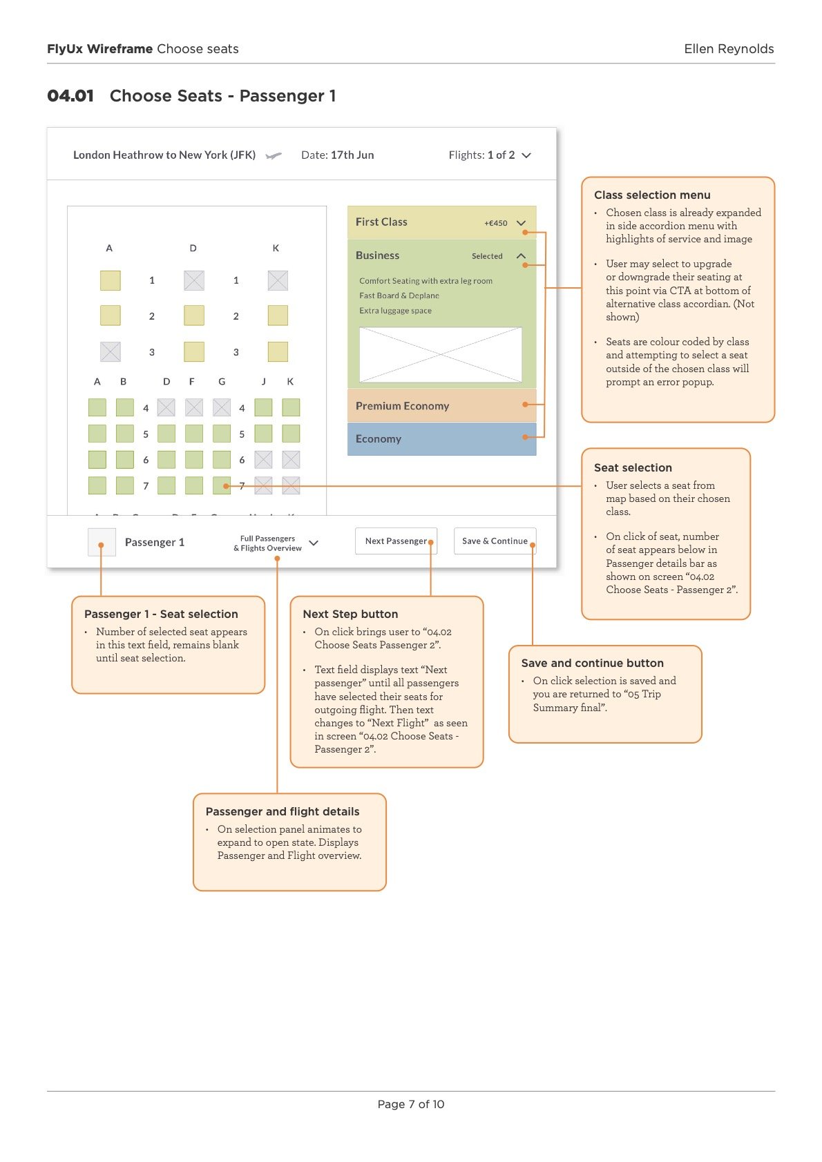
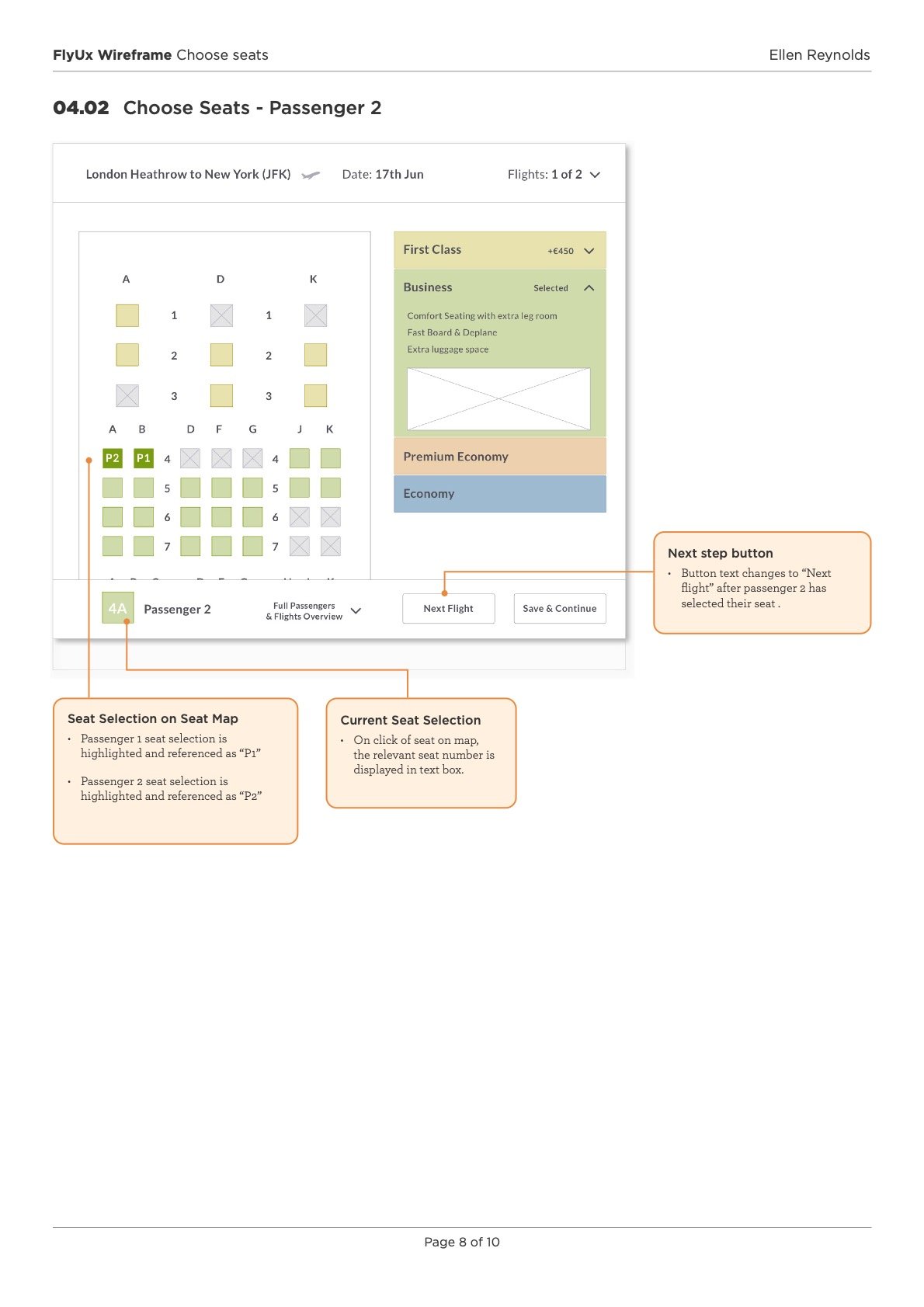
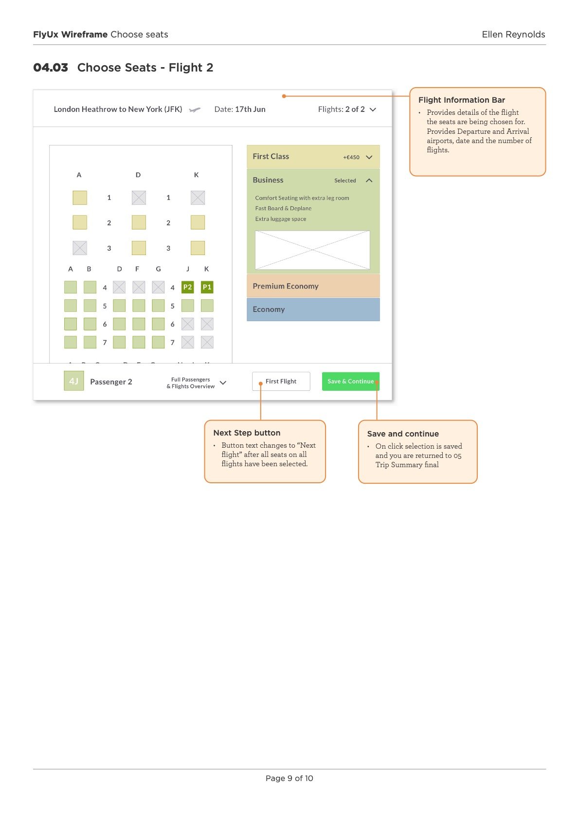
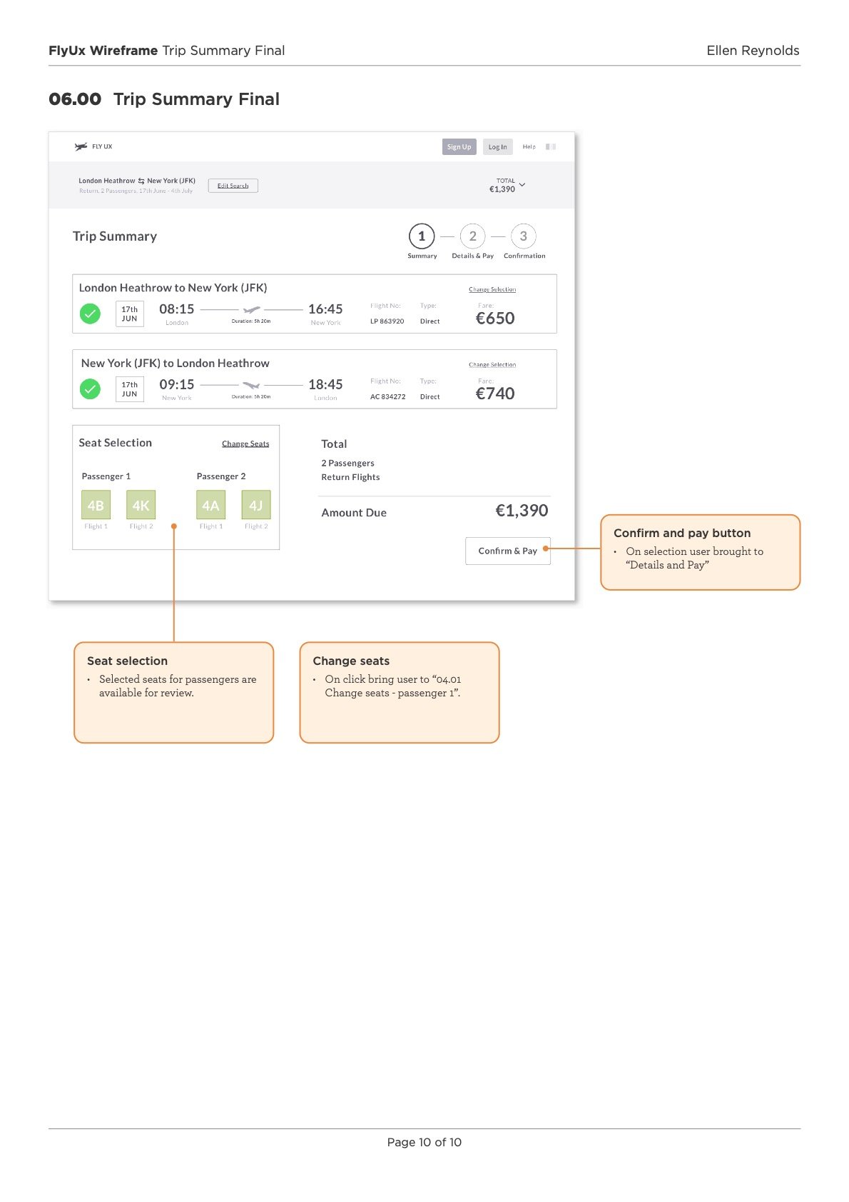
Hand-over documentation
I created a wireframe once the UX designs had been completed. This document is for the development team and required for a smooth handoff. A wireframe is an annotated specification to define the controls, rules and feedback by explaining how the design works.
High-Fidelity Design
Just prior to completing the design phase, the last important task involves crafting high-fidelity visuals.These designs serve as the primary reference for software developers during the app development process. Below I have included a design for FlyUX homepage.

Conclusion
I think a vital bit of understanding I took from this course is that UX is a research -based discipline, you can’t solve peoples problems if you don’t know what those problems are and something that was repeated in the course that really sticks with me is “if you’re not doing research you are not doing UX”.
The UX Design Institute really crafted a great course here that was incredibly hands-on and taught me the structured process of UX. It illuminated how UX isn't just a collection of unrelated pieces; it's a cohesive discipline. Now, I'm equipped with the confidence to apply the UX process effectively, and I can proudly showcase the projects I've successfully completed along the way.
Contrary to feeling stifled creatively, the UX process establishes guidelines that lead to more successful outcomes. It's genuinely thrilling to witness these methods in action, and it's even more exciting to have a focused path guided by data that validates the success of your designs..
Thank you for reading!
For more work inquiries or to grab a coffee email me at: hello@ellenreynolds.me